Gather
A social app that helps seniors stay close to the people they love

Project Overview
Gather is a mobile social app designed to help seniors stay closely connected to their families. Built over 3 months, the project set out to close the gap between existing social platforms and the specific way seniors experience connection: through family, events, and real-time contact, not overwhelming feeds and followers.
My Impact
I led the visual design and interface direction for Gather. After researching our target users, I made key decisions around the app's visual style and defined the interface direction the team designed around. I also led the design of core screens like the calendar page in Figma, then prototyped the experience also in Figma and ran usability testing with seniors to validate the flow.
Team
Anmol Sekhon
Karanjit Singh
Jinyu Guo
Platform
Figma
Figma Prototype
Figma Make
Timeline
July - Oct 2025
3 Months
Deliverables
User Personas
High-Fidelity Mockups
Usability Testing
Final UI Design
Overview
How do you design connection for the people tech keeps leaving behind?
Every major social platform is built for people who can instinctively use a phone in their hand. Seniors aren't in that picture, so they get left with tools that weren't built for them, or no tools at all. Over 3 months, my team and I set out to design Gather: a social app that puts connection back in reach for seniors and the families who miss them.
The Problem
Nearly 1 in 4 seniors living independently are socially isolated.
We started with a number that stopped us:
"Almost one in four older Americans living outside nursing homes or assisted living are socially isolated, and close to half of adults over 60 say they feel lonely."
Strengthening Social Connections in Older Adults
That statistic reframed the whole project. We realized the challenge wasn't about making an existing app fit the problem, it was about addressing the deeper issue: people feeling disconnected from the people they love.
The Solution
Gather: a social app where family is the whole point.
Gather gives seniors one place to stay close to the people they love: sharing life updates, messaging and video calling family, and keeping track of events that matter to them. No strangers to filter, just the people already in their lives, made it easier to reach.

Core Flows
Staying in the loop, without the noise
A simple home feed providing quick access to family and upcoming events, so nothing important gets buried.
No guessing which app to use
Message, call, or video call all live on the same contact card, so there's one place to go regardless of how someone wants to connect.
Every family event, in one place
The calendar page pulls family events into a single view seniors can actually follow.
Research
We went straight to the people we were designing for.
Instead of designing from assumptions, we researched the target group directly, then cross-referenced what we found against the isolation statistic that started the project. Two things kept surfacing:
Real-time contact, not static updates
Seniors wanted to actually talk to family, not just only a feed of what they'd been up to.
Events they could plan around
A calendar they could count on mattered more than an overwhelming feed with strangers.
Meet the Users
Randy and Elizabeth just want to be part of the family, in real time.
We built personas to keep the team anchored to real people instead of our own assumptions. Randy and Elizabeth are both grandparents who want to be more involved in their kids' and grandkids' lives, but the tools available to them weren't built with that goal in mind.

Exploring Directions
Three designers, three very different starting points.
Before sketching, I used AI to widen the net. I ran a few rounds of prompts asking for alternative directions and edge cases we hadn't considered, not about finding an answer, but about not walking into Figma with tunnel vision. A few of those angles didn't go anywhere, but a couple pushed our thinking. From there, we each sketched an early concept independently in Figma. Seeing them side by side made it obvious no single direction had it right, but together, they did.

Why a Social App?
It matched how seniors think about connection
Family, events, and shared moments, not feeds and followers.
It supported every feature seniors asked for
Messaging, video calling, and event visibility all fit naturally into one format.
It gave us room to design for closeness, not scale
We were optimizing for the people who matter most, not for engagement.
After deliberation within our team, we merged the strongest pieces of all three directions and confirmed the format: Gather would be a social app, built around family.
Prototyping & Testing
From sketches to something we could actually put in front of people.
With the core flows taking shape, I turned the designs into a high-fidelity prototype in Figma. This gave us something more meaningful to evaluate than individual screens: a complete experience that could be navigated, tested, and challenged from a user's perspective.

Usability Testing
Watching three seniors use Gather taught us more than any assumption could.
I ran one-on-one sessions with three seniors aged 65 and older. Each started with a short pre-test questionnaire, then moved into hands-on tasks while I took notes on where they paused, hesitated, or got stuck. I wasn't just checking if they could complete a task. I was watching for the moments they second-guessed themselves.

Key Insights
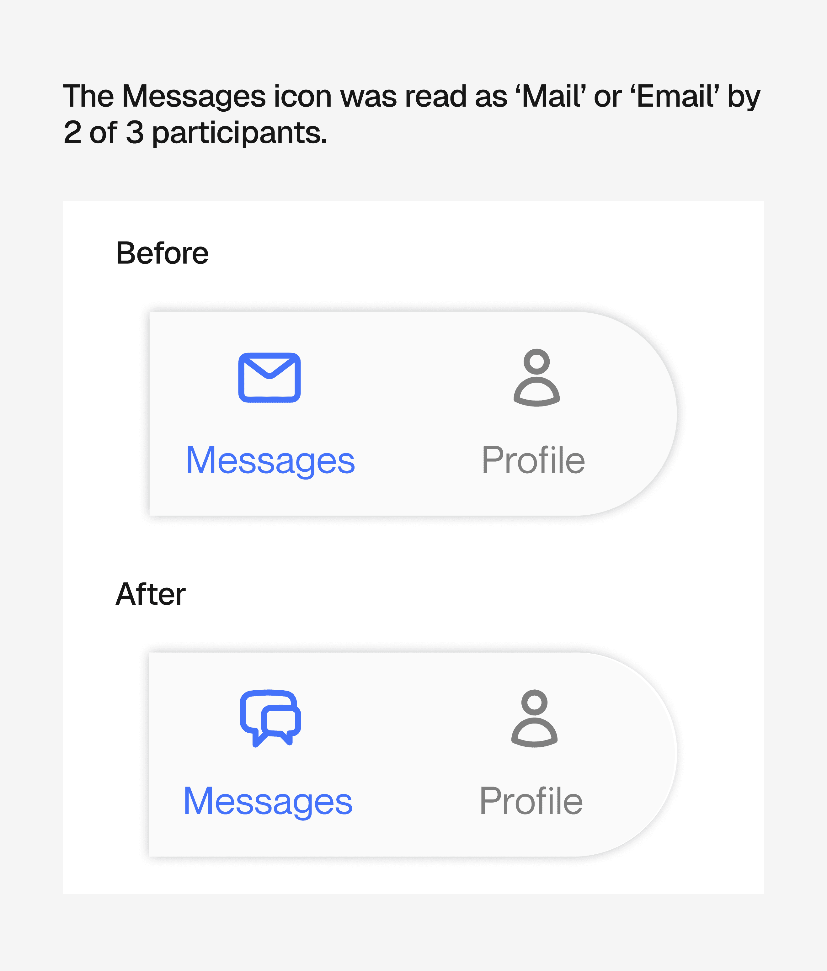
Icons need to be obvious, not clever
A few icons we thought were intuitive weren't. Clarity needed to be prioritized over cleverness.
Size communicates confidence
Inconsistent icon sizing made users hesitate, even when they understood what to tap.

One wrong turn is enough to lose someone
A few flow issues caused real confusion, not just minor friction. For this audience, there's very little room for ambiguity.

Final Design
Gather, built to close the distance instead of the interface.
Between usability testing and feedback, we arrived at the final version of Gather: a mobile app that helps seniors stay genuinely connected to their families, designed around how they already think about connection instead of asking them to adapt to a format built for someone else.

Reflection
What I learned
Accessible design is just as important as good design
It's also its own design problem, with its own logic. Simplifying an interface isn't the same as designing it for a different way of thinking.
Feedback is only useful if you actually use it
Collecting usability notes doesn't change anything but acting on them does. That distinction shaped how I approach every critique since.
More time would have benefited the iterations
If I had more time, I'd want to test at a much larger scale. A bigger sample would tell us more about where Gather falls short.